

I haven't really talked about digital painting on my YouTube channel. Partially because most of my digital painting is done on my smart phone which has a pretty small screen and filming a screen has its unique challenges like glare.
Some of you may try digital painting on something bigger like an iPad.
If you haven't tried digital painting perhaps this article will give you some inspiration to try.
The reason I sketch on my smart phone because it's always with me and thanks to the undo button it feels like there is no fear of making a mistake. It's a great way to experiment.
I think the thing that surprises me the most is how much painting digitally has taught me about using color. Color is surprisingly referential. A single color or hue can look wildly different based on its value (luminance) or tone (saturation) not to mention the colors it is next to.
The examples below are from the Artrage painting software, but these concepts of choosing and creating natural looking colors can be applied to most digital painting programs available today.
Getting Natural Looking Colors in Digital Painting
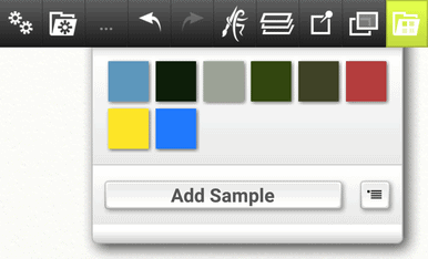
The best way to get natural looking colors is to sample them from photos. Many painting software programs allow you to sample colors using a color sampling tool. In most apps, including Artrage, this tool looks like an eye-dropper (shown on the left in the image below).
The most basic approach is to simply import an image into a layer in your program and use the eye-dropper to “pick a color” from an area in the photo that has the color you like. Once you have the color, you can save it in the samples area with the “Add Sample '' button as shown below in the Artrage mobile app.

The downside to this approach is it can be tedious to pull a lot of colors and sometimes that results in a color that is slightly more gray than is desired so a better method is to use a color picking app.
Using a dedicated app for color picking can also speed up the process. There are dozens of these types of apps for the iOS or Android that will allow you to pick or sample exact colors from an image. You can also use a website like https://imagecolorpicker.com/
On that site it is super easy to upload an image of your own that has the hues you are looking for. According to the website, your image isn’t actually sent, instead the magic happens in your browser locally on your own computer. In other words, they think data protection is important!
Once you load the picture to the website, the samples are extracted in the samples bar below the image. From there you can Import your screenshot to your painting software and simply sample the colors from the squares.
Here is a quick image of my own that I uploaded to https://imagecolorpicker.com/ and the colors that were sampled from the image are shown in the bar below it.
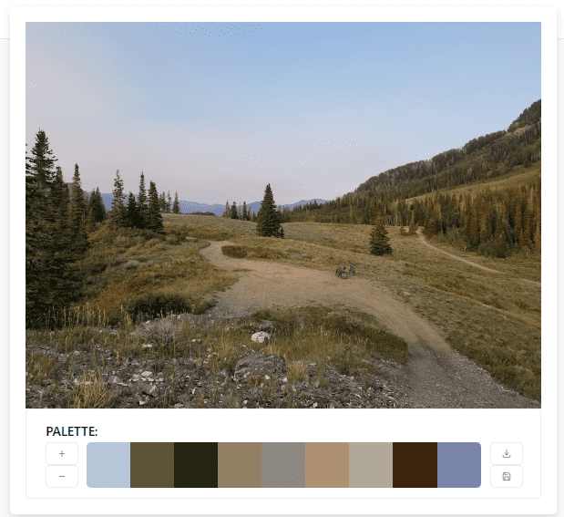
Notice that the third square from the left is the only green (very dark) color sampled even though there are many trees in this image. The main reason for that is that a hue can look very different depending on the saturation or value (luminance) applied to that hue. Read on for a demonstration of how value and saturation affects how a color looks in a painting.
With the new colors in your sample palette, you can now be confident that the colors you choose will be more natural and your paintings will look great.
Sampling photos taken from nature makes sense because nature blends and contrasts really well with itself. Mother Nature is an amazing artist! The natural world is what our eyes are used to seeing, so use these colors to your advantage.
Understanding Hues, Value and Saturation with the Artrage Color Picker Modes
Once you have your chosen hues, you can manipulate the color and choose different values (luminance) and tones (saturation) of those base colors to create a painting.
These properties of luminance and saturation are chosen from the color picker. Understanding the differences in the color pickers can help you understand the different ways you can present the same hue.
In Artrage, there are three types of color pickers for Hue, Saturation and Luminance.
These different modes that can be used to display color in different ways. The color options menu which can be found in the Tools menu. On the phone app you can do a long press on the color picker to pull up the menu.
The modes are labeled by the properties H, S, and L.
H = Hue
S = Saturation
L = Luminance
HL/S Mode in Artrage
HL/S mode moves the Saturation (S) value to the outer smaller arc. The inner larger arc contains the Hue (H) and the Luminance (L) of the color. Switching between the HL/S and HS/L view gives a bit better idea of the difference between luminance and saturation. In the outer arc you can see the saturated mode has no white added and instead the hue is dulled slightly by gray.
Below is an example of a light bulb study using only this saturation (S) level as the variable. (The outer arc)
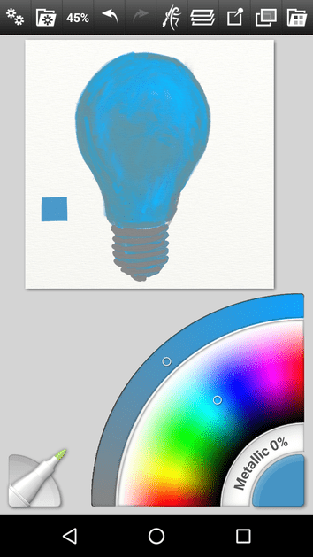
The result is quite flat as you might expect without luminance or value.
HS/L Mode in Artrage
HS/L mode moves the Luminance (L) setting on the outer arc. You can see here that the luminance adds white to the color on the bright end and black to the hue on the dark end. This provides a good approximation of mixing value into a color.
Below is an example of a light bulb study using only the luminance level as the variable. (The outer arc)
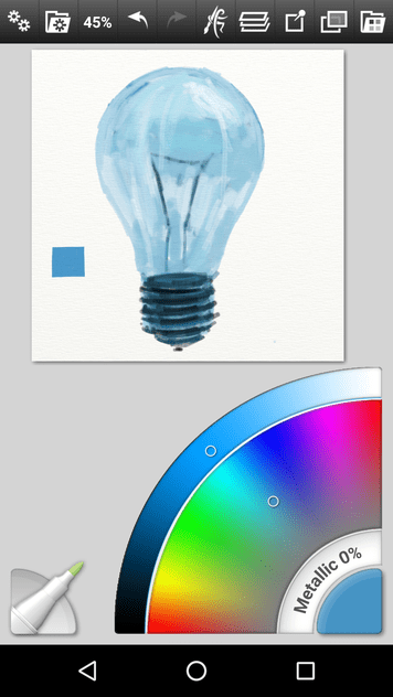
The result gives stronger values but lacks any gray tones.
LS/H Mode in Artrage (Default mode)
In this setting the hue (H) is displayed in the small outer arc and the Luminance (L) and Saturation (S) values are in the big inner arc. Luminance goes left to right and Saturation goes from top to bottom. In this mode you can pick a single color from your sample and then simply pick from the large arc the values within the hue. This can produce some really great monochromatic studies.
The two non default modes of HL/S and HS/L help explain the default mode of LS/H a bit better. Saturation is from top to bottom. Luminance is left to right.
Below is an example of a light bulb study using both the luminance and saturation levels as the variables.
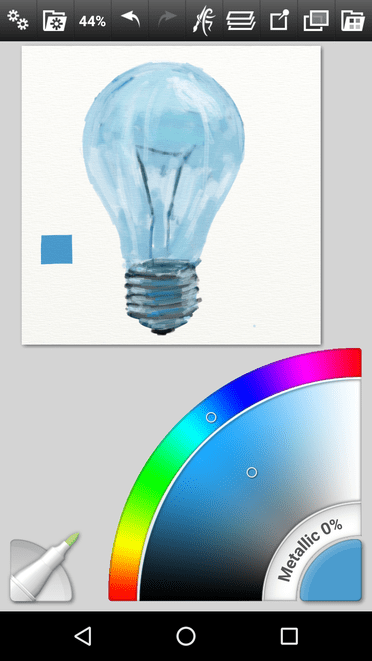
Here I can use black and white values and gray tones. The result is much better in my opinion.
Learn and Practice the Basics of Color Theory
You can choose a single hue and paint a study of an object using either the luminance or the saturation of the hue as the only variable. This is a really important concept to learn in both digital art and traditional art with paint, pastels or pencils.
Below is a really cool video that explains the concept of Luminance and Saturation of a Hue even further by the excellent digital artist Marco Bucci
Video by Marco Bucci
I highly recommended watching this video to learn more